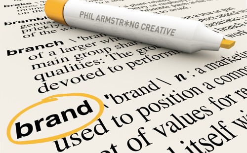
3 ways to make your brand explode with personality.
Why? Because in order to compete with all the other brands out there, you need to differentiate yourself visually and creatively. You want your audience to know that the space is yours in the quickest amount of time. Ask yourself this question: If you were to remove some of your branding from your latest ad (like your logo) would your audience still know it’s your ad? If you then removed all the copy set in your corporate typeface, would they still know it’s from you? If the answer is yes to both of these questions, then you’re probably already on the right track. But if it’s no you’re missing a trick. Or three. Here’s a design checklist.
1. Add some form of blanket branding.
Such as a pattern, tint, illustration or overlaid creative device. But make it original. And in line with your core brand message. A few years ago I was asked to create a logo design for a local badminton club. The club had the word ‘Eagles’ in their name. So obviously their logo had to feature an eagle. Had I been asked to produce the other elements of their brand identity I would have perhaps taken silhouettes of the edges of shuttlecocks to form a nest-like pattern or a band that could have been overlaid on all primary surfaces. Early shuttlecocks were also made of feathers, which is another connection.
2. Add some form of partial branding.
Such as the way you treat headlines, perhaps underlined, or all in caps. Or a certain creative style of drop cap at the beginning of body copy. It could even be the way you colour the dots on the i’s or full stops at the end of sentences. Be imaginative with your brand design, but be relevant. Or you’ll end up with decoration for decoration’s sake.
3. Don’t use colours similar to your competitors.
Check out the competition’s branding before you commit to a Pantone reference. And pick a primary and some secondary colours that go hand in hand with your creative brand idea. Be careful with bright green and orange though in your designs if you’re planning on doing a lot of short-run digital printing, or you’ll end up paying more for spot colour litho.
About the author:Phil Armstrong is an award-winning Art Director and Designer with over 25 years experience in brand design, marketing and advertising. He works directly or through design and advertising agencies for clients and brands throughout the world and can be reached or commissioned by clicking here.