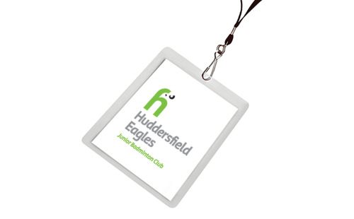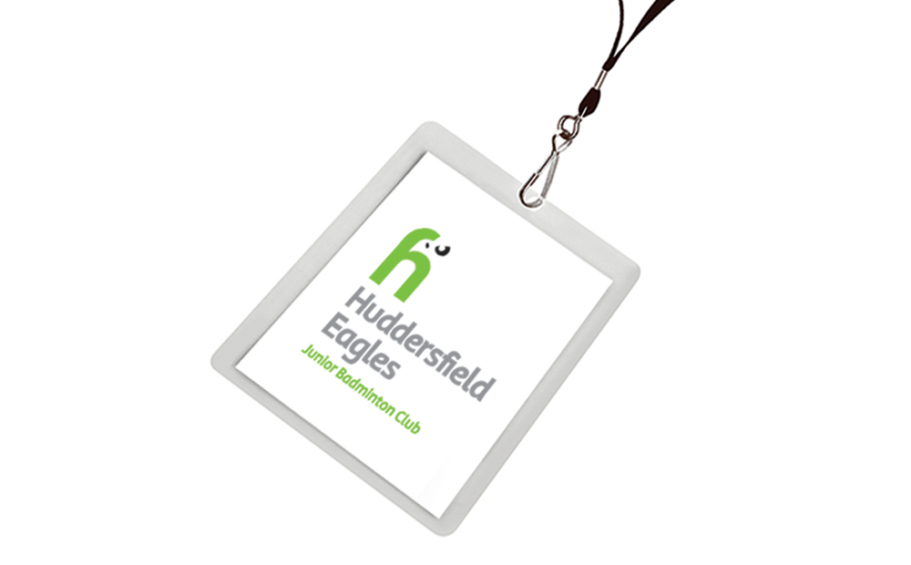
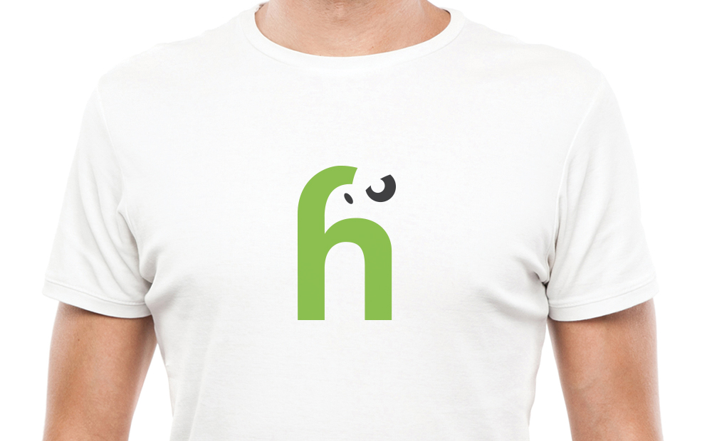
Huddersfield Eagles
I quite like the idea of using negative space within a logo. Some people at first glance miss the eyes and beak. I didn’t go as far as creating elements for this brand, but if I had, it would have probably been the edges of shuttlecocks. Arranged in a nest-like fashion. Graphically treated.