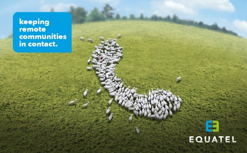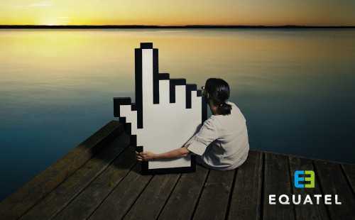
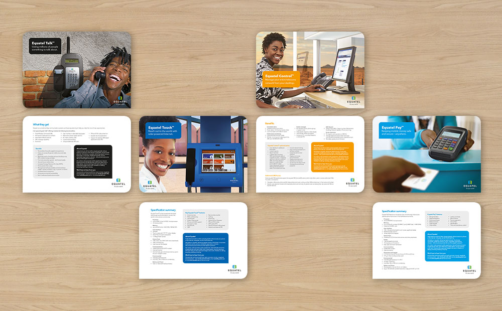
Equatel brand
It’s not often you get an opportunity to be part of something that could really make a difference to peoples lives.
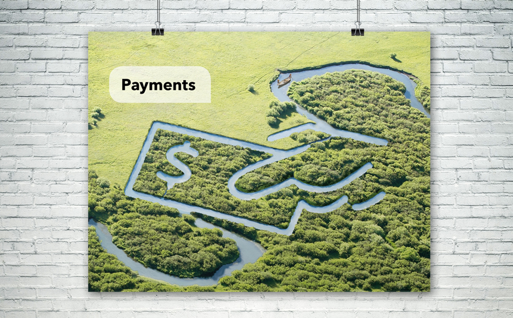
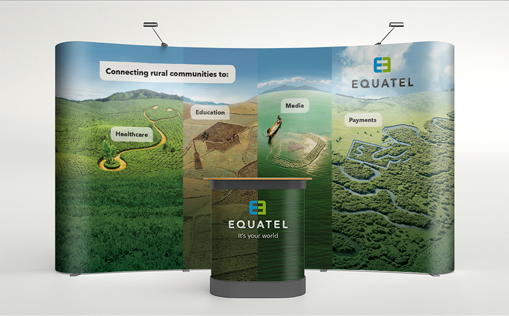
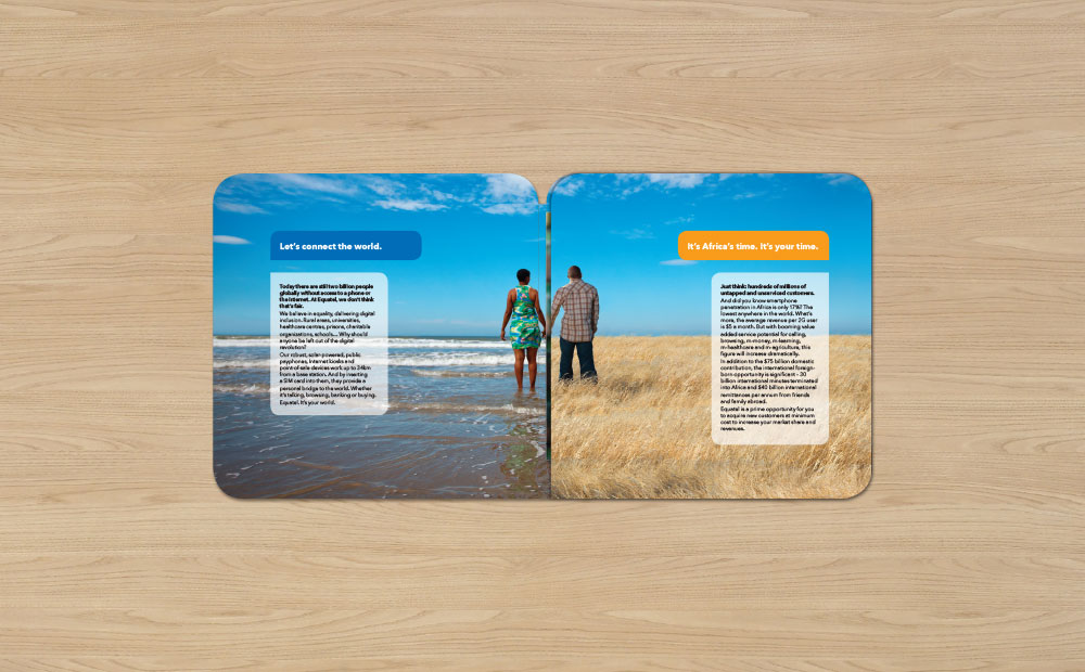
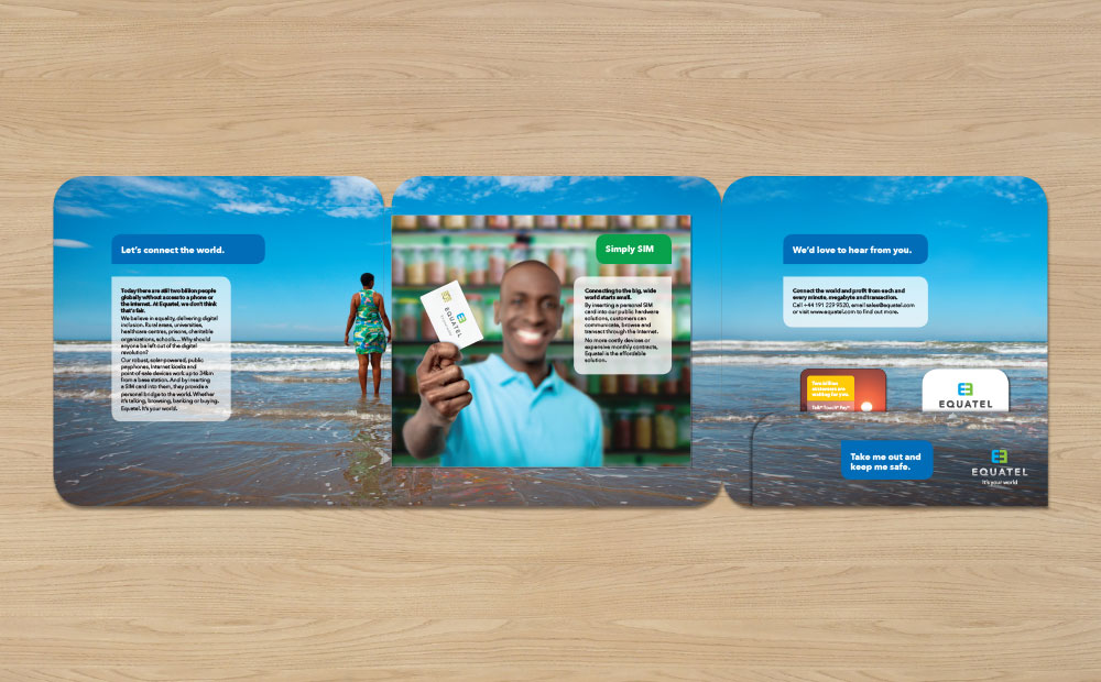
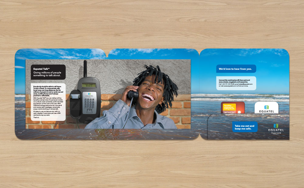
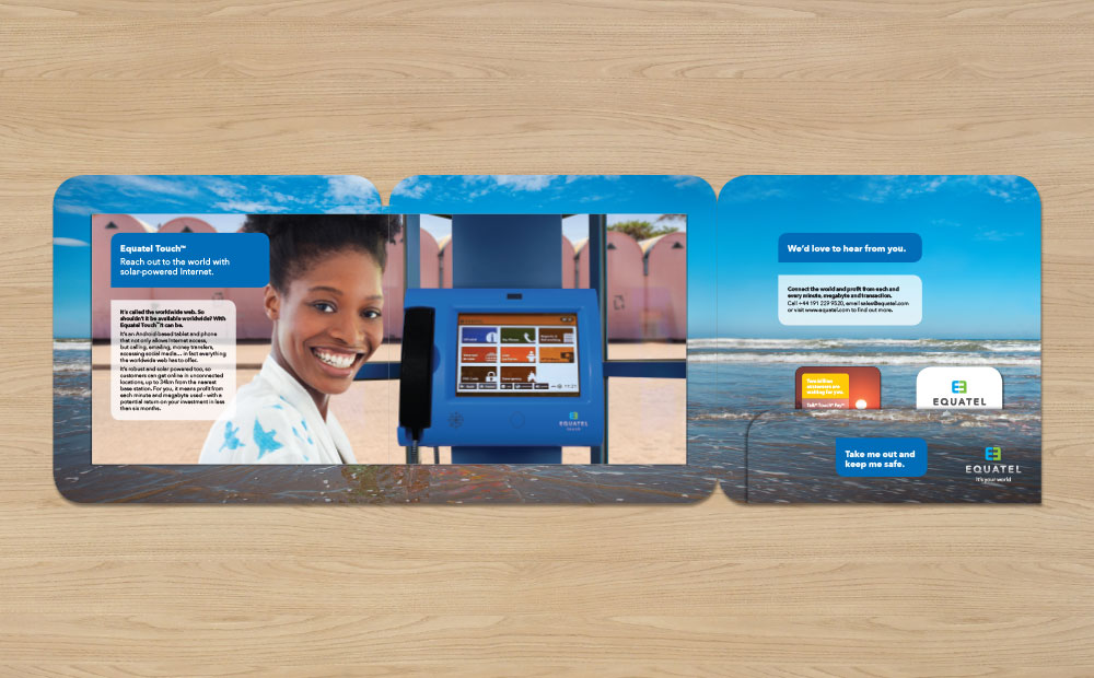
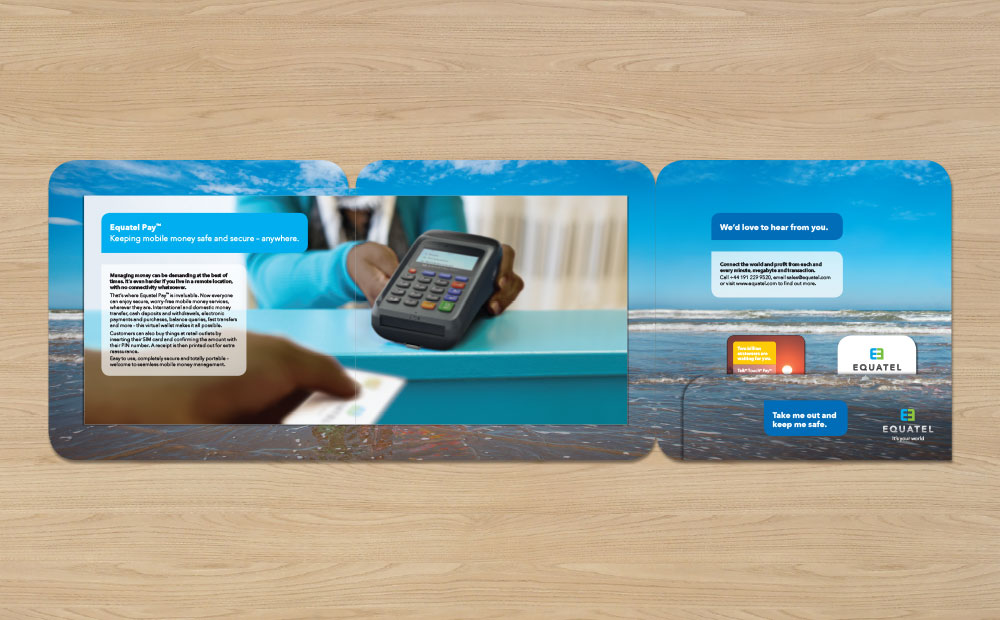
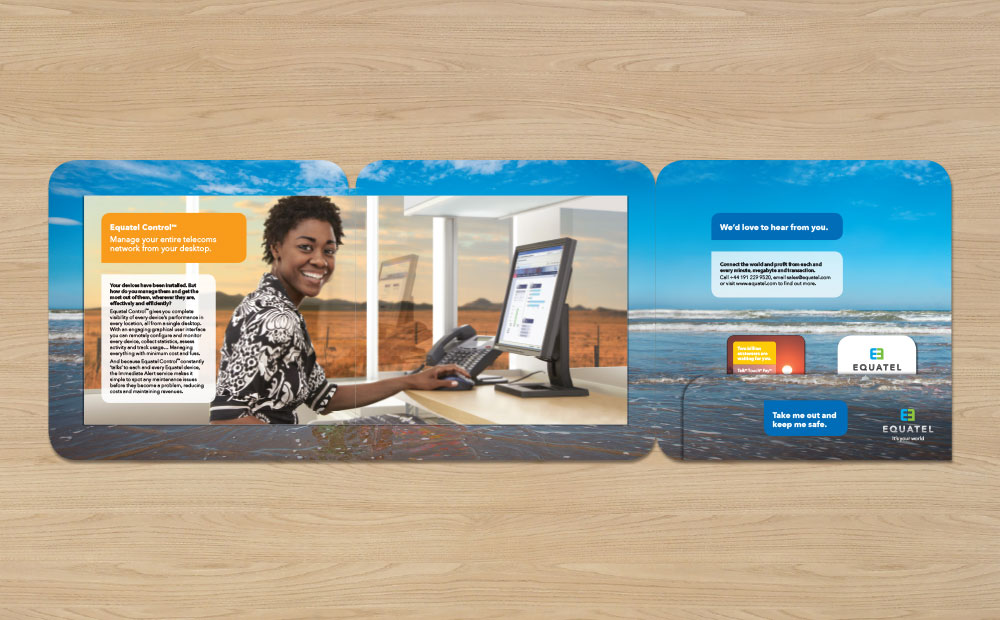
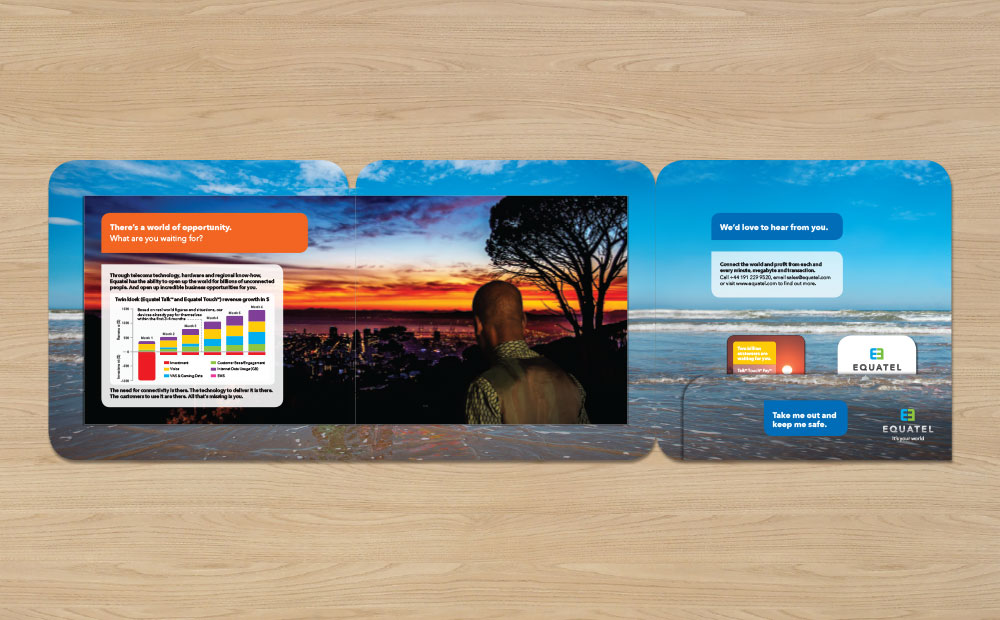
Equatel designed and manufactured a suite of robust public hardware devices that allow people who don’t have a bank account, mobile phone, or computer, the means to be able to get online, communicate and handle money, without electricity and up to 34km from a GSM base station. All with just a sim card and a pin number.
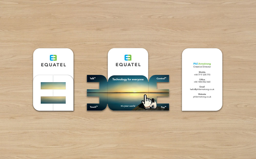
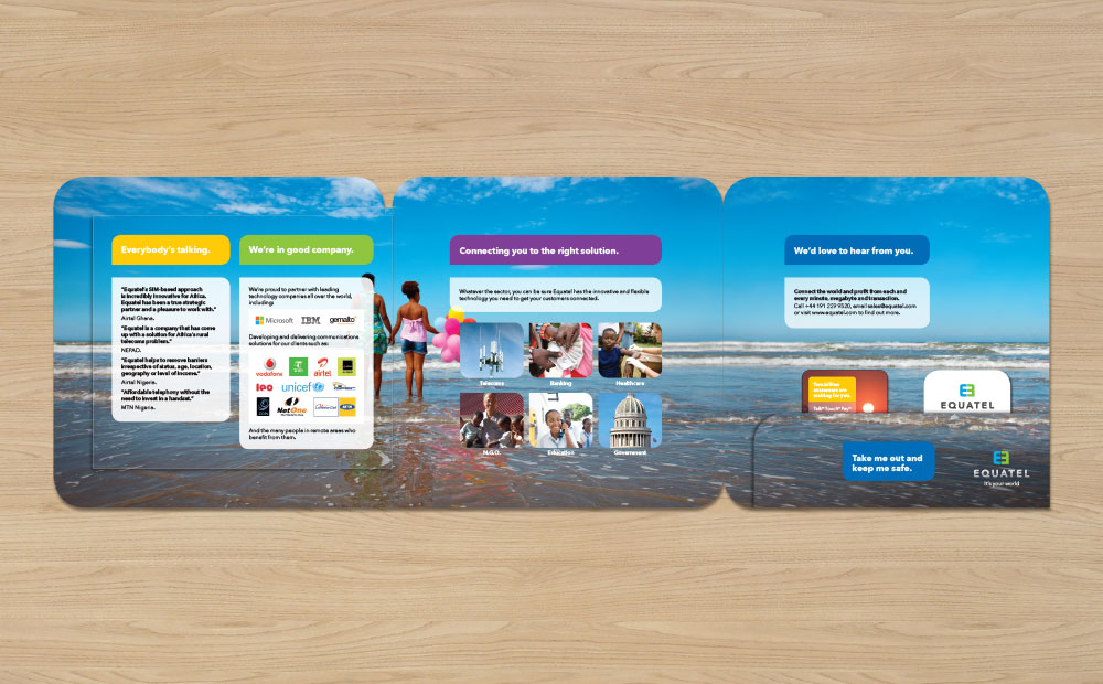
I named the products (Talk™, Touch™, Pay™ and Control™), created a visual brand identity for the company, an event banner, product literature, slide deck and a ‘flipping book‘.
The logo is representative of equality through telecoms, with the two ‘E’s coming together to form an equals symbol within a dialogue icon. Which I echoed in text blocks and cut-outs within their collateral.
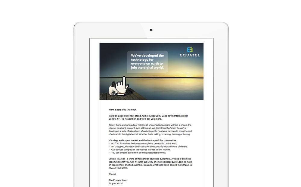
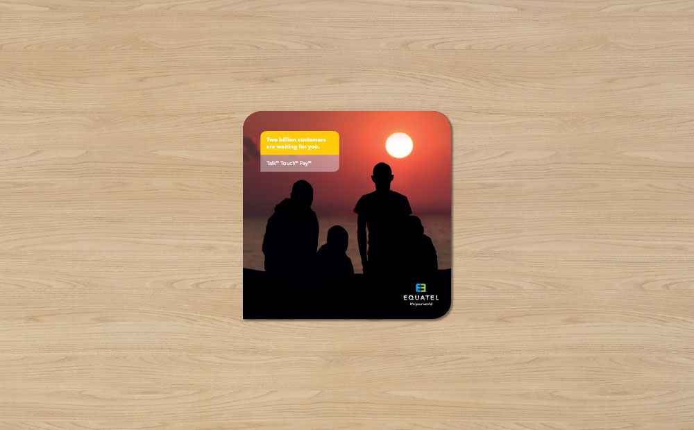
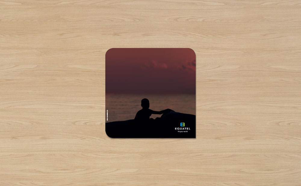
But the star of the show in this identity is the presence of a horizon (or horizontal line on secondary surfaces). That continuous division that separates us. We all see it, but many are deprived of experiencing what’s on the other side of it: Knowledge, healthcare, Love… And my empowering strap line for this brand:
“It’s your world.”